Clumio's enterprise SaaS backup product had a lot of functionality: it not only allowed users to connect, backup, and restore multiple data sources, but also provided reports, dashboards, alerts, and administrative functions such as user management, roles, and permissions. The information architecture had become unwieldy as more features were added, and this was a particularly acute problem given that many of our users were not in the application regularly. When they did come in, often something had gone wrong or there was an urgent need to restore something quickly, and many users had trouble figuring out where to go.
I was the lead designer for a large-scale, UX-driven project to redo the information architecture and navigation to increase users' ability to find what they were looking for. I also directed the work of a visual designer and three product designers on the project.
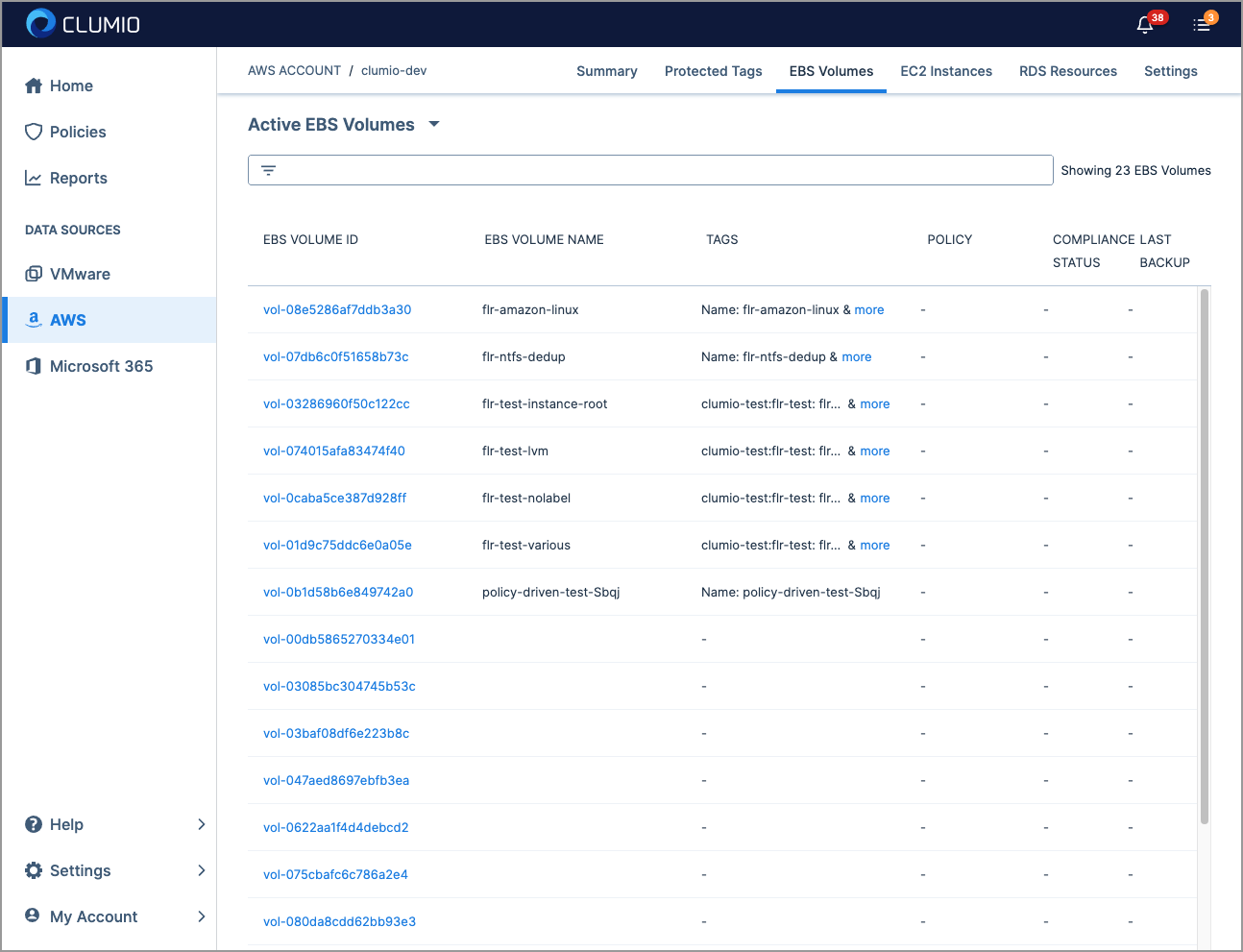
The previous navigation had a lot of problems: it took multiple clicks to get to most pages, it wasn't always clear what led to what, and important links were buried in the top right and bottom left corners.
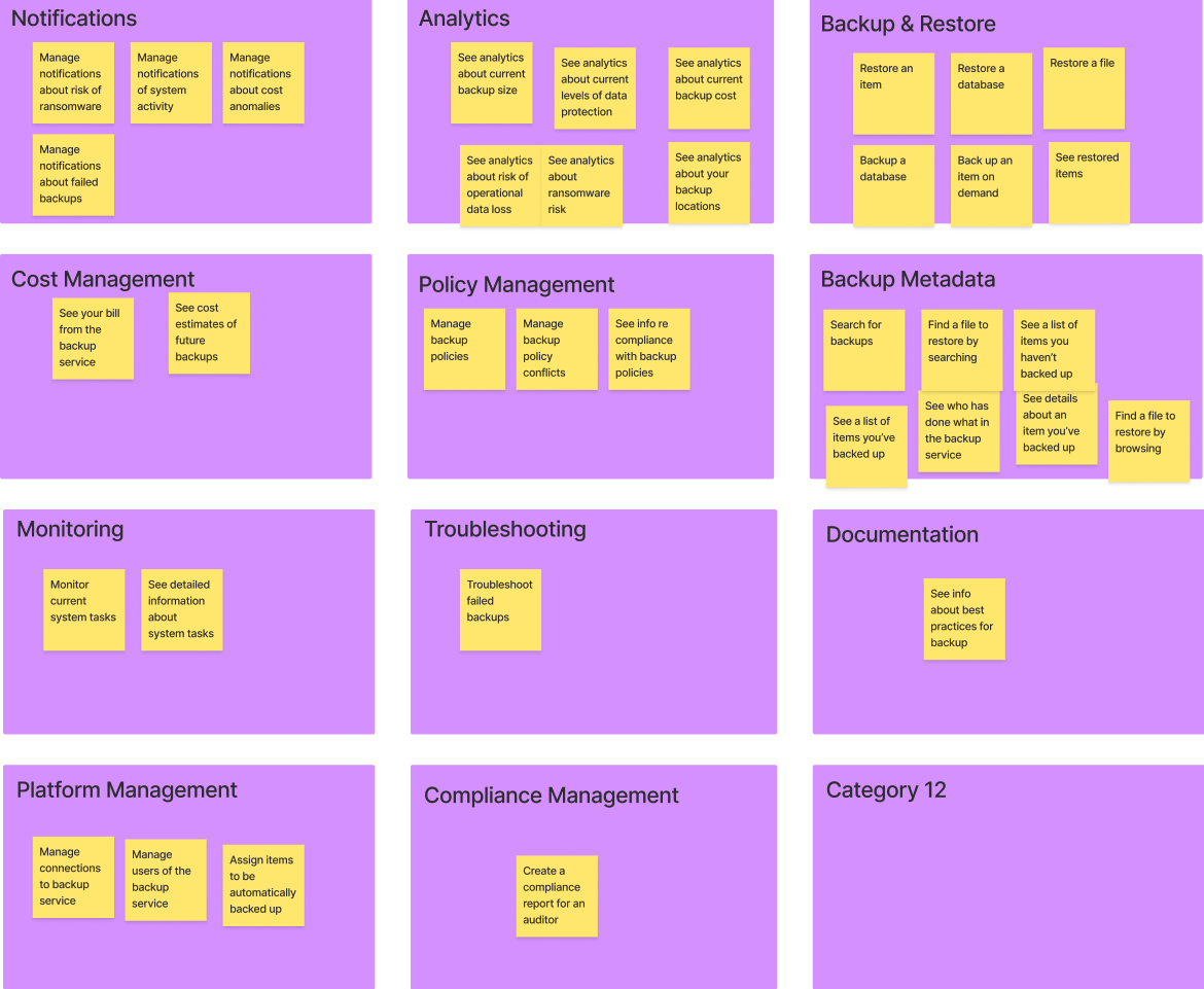
I started from first principles and oversaw a card sort with participants who fit our target user profile, to understand the best way to group and organize our features.
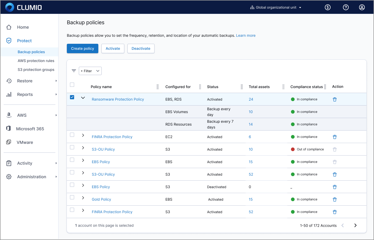
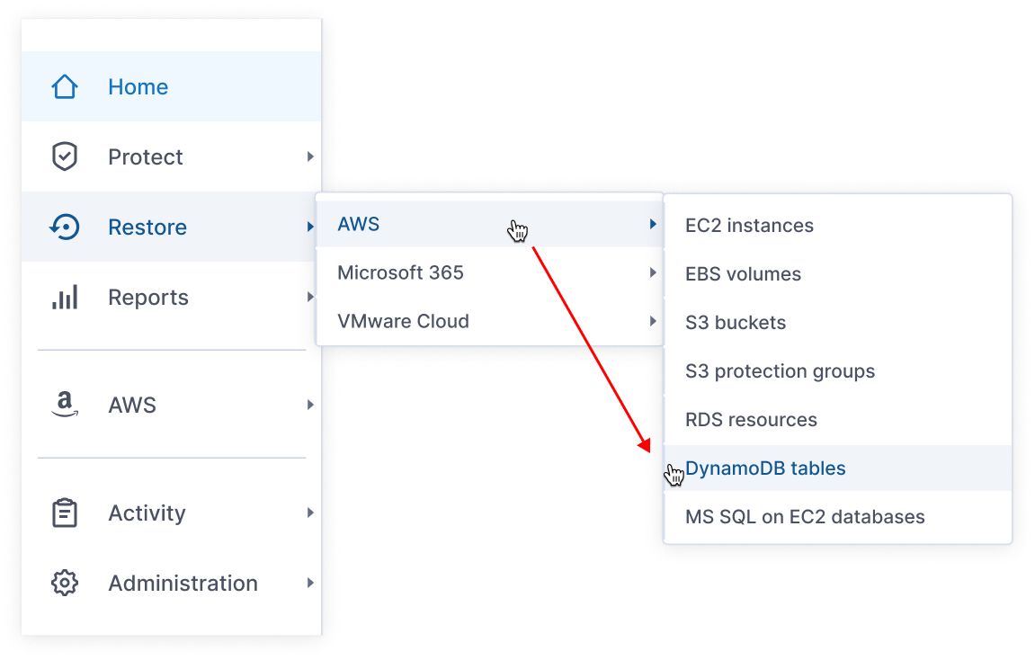
I consolidated all of the important functions into a dynamic, collapsible side nav bar, and standardized the page layouts.
Every page had a consistent look and page header. Where it was needed, I added a brief explanation with a link to learn more.
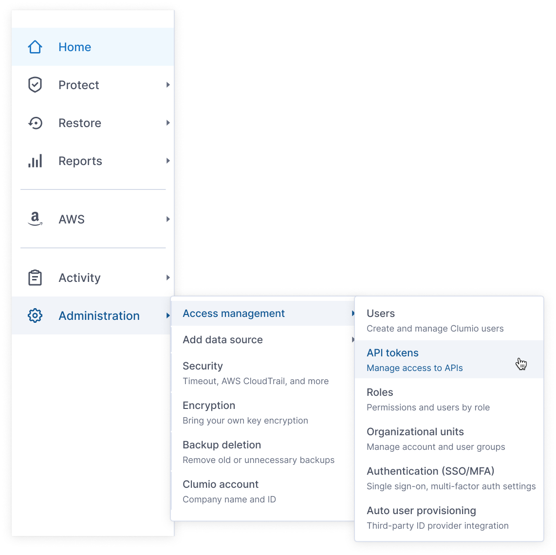
I greatly increased the functions accessible directly from the nav by including second and third levels of the primary nav items, making almost all of the important pages in the application reachable via a single click.
The second and third level nav items had short descriptive text to help users understand what they meant.
I paid a lot of attention to the details of the interactions on the nav bar.
For example, I successfully pushed the UI developers to write code that predicted what the user was trying to do based on their cursor movement, so that if a user took a "shortcut" on the way to a secondary or tertiary nav item, the nav overlay would not disappear.
I conducted multiple rounds of usability testing, iteratively improving the design until I reached our goal of 90% task success.
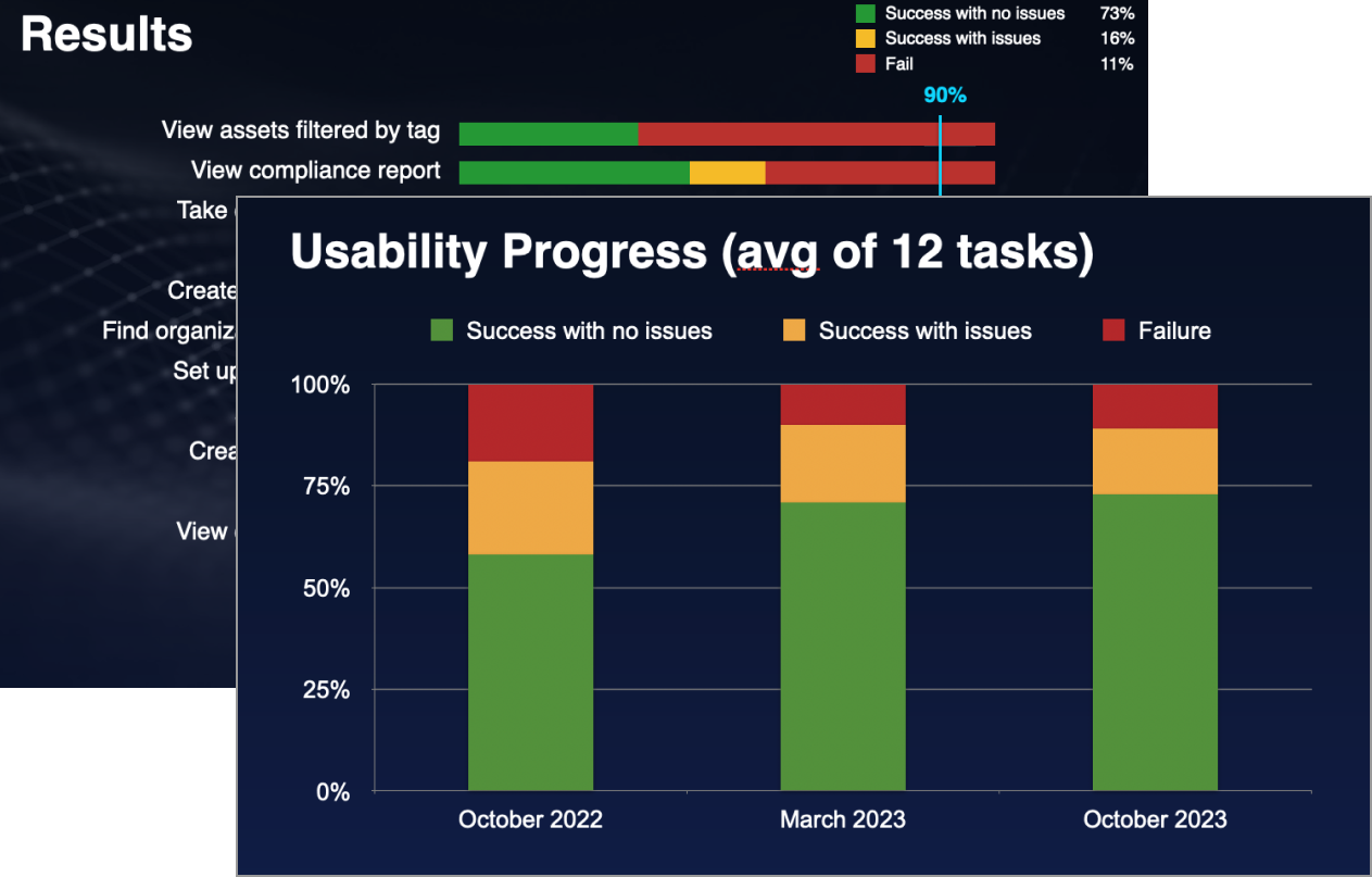
The new navigation reduced clicks by over 30% and got rave reviews from our sales force and customer service, who found it now much easier to demo and explain things to customers. Because the new nav was designed for new users, we rolled it out as an option at first, anticipating pushback from existing users. But it turned out that even existing users strongly preferred the new nav. Ease of use was one of Clumio's competitive advantages, and the new navigation I designed helped secure that.


