SuccessFactors, the leading provider of cloud HR software, had a suite of over 20 modules covering all aspects of HR for their 3500+ enterprise customers. The SuccessFactors' People Profile was meant to combine HR information about a particular person from all the different modules. But at the time the project started, the People Profile failed to provide the kind of integration users needed, making it a competitive disadvantage for us.
I was the UX Architect for a team of five interaction designers assigned to redesign the People Profile from scratch. My role was to design the framework, structure, and UI patterns of the profile - the foundation on which the rest of the design was based.
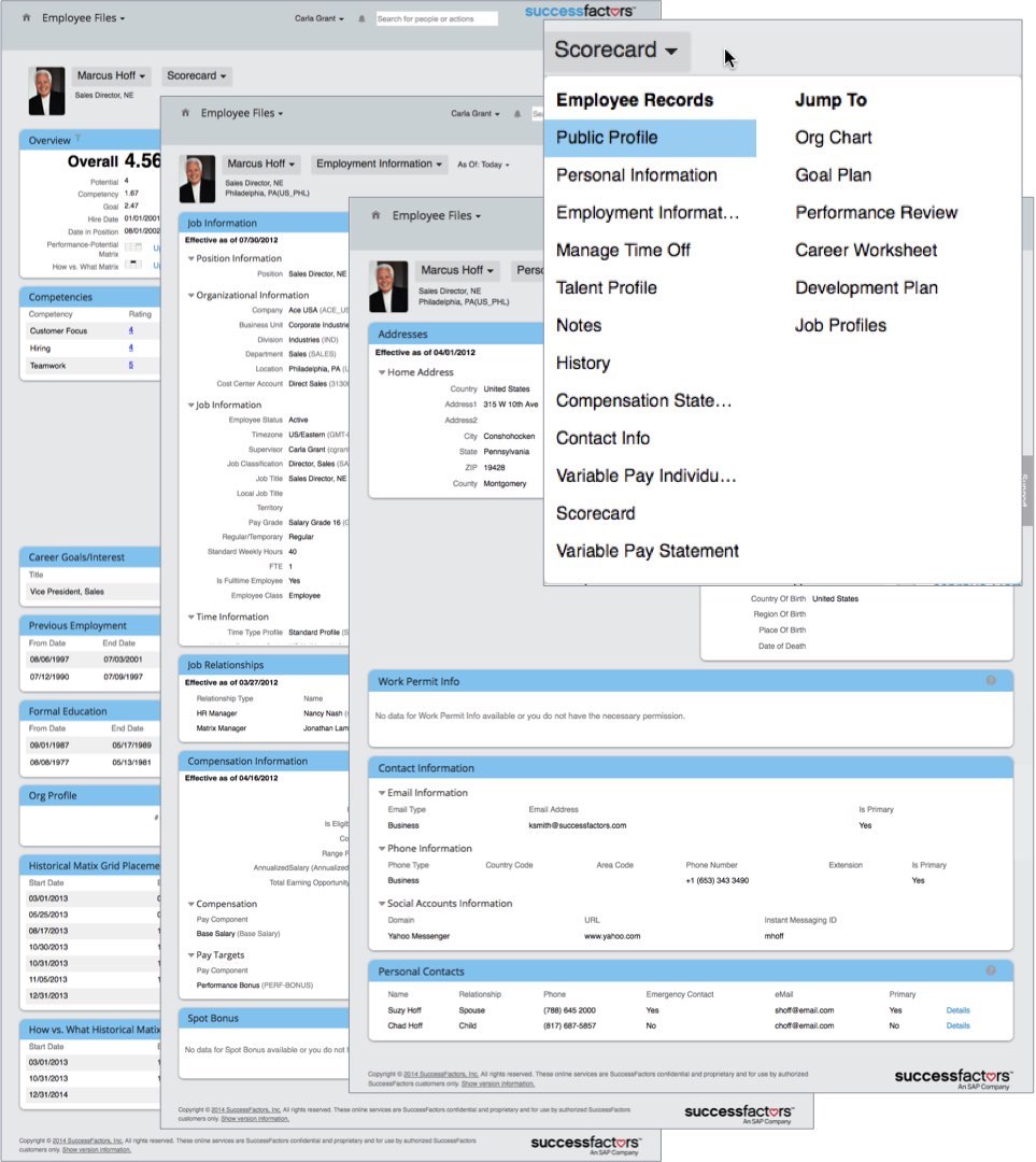
The previous version of the People Profile was spread out over many pages and shown in generic data tables, making it nearly impossible for a user to get an overview of an employee or to find specific information about them.
Our goal was to provide an integrated view of relevant information at a glance.
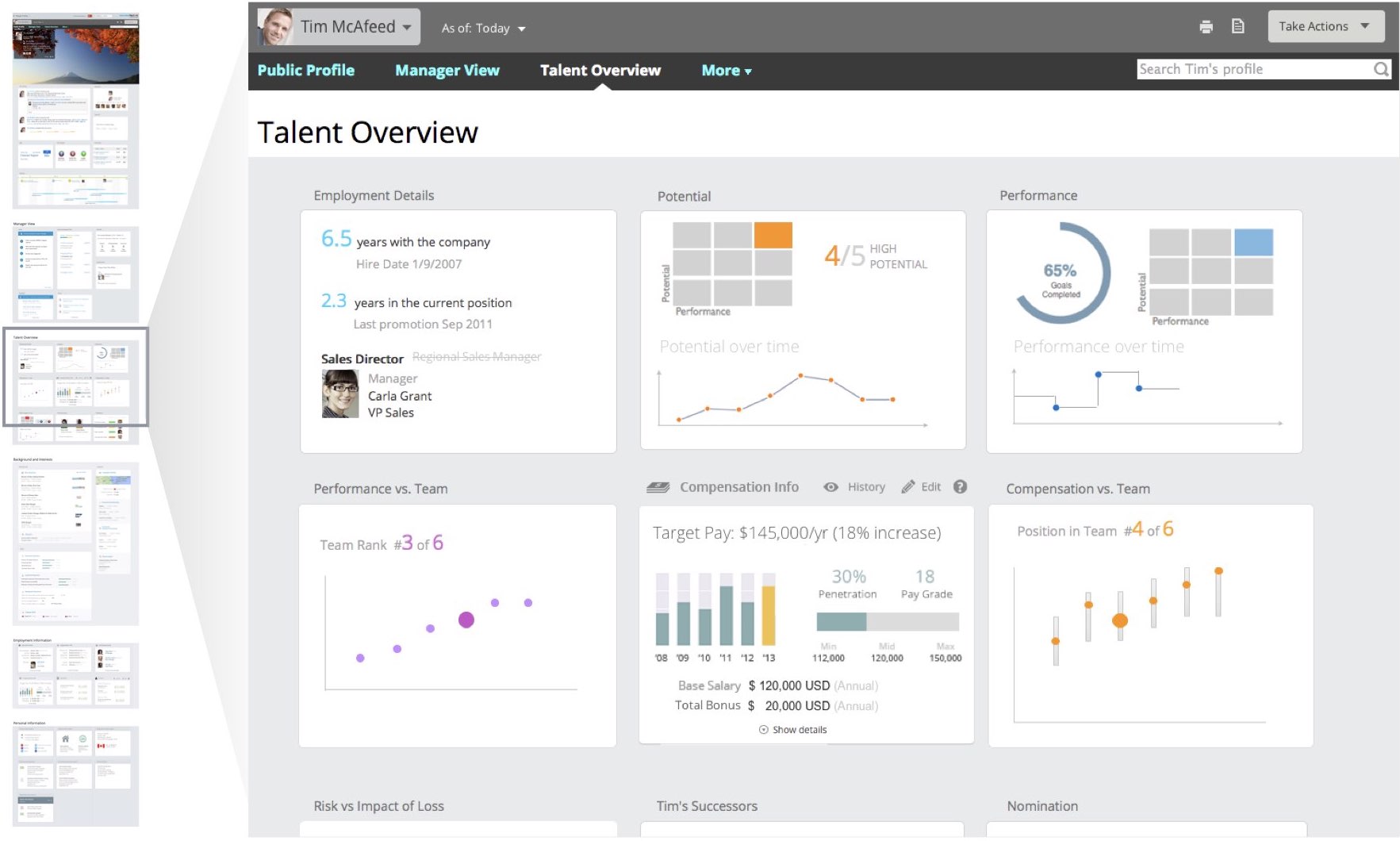
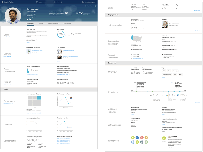
My early wireframes explored the idea of a single long page with a persistent nav, divided into sections with "blocks" of graphical, summary information that could be expanded to show more.
I created a prototype and conducted a user test on this concept.
Testing showed that users had no trouble scrolling or using the persistent nav to navigate through the page, so I kept the profile as a single page as the design evolved.
But in testing users did have trouble with the density of information, the ability to scan, and the expand/collapse behavior of the blocks.
To solve these problems, I added a level of hierarchy in the final design - blocks were now paired into subsections that were labeled on the left. This decreased the density of information and made the page easier to scan.
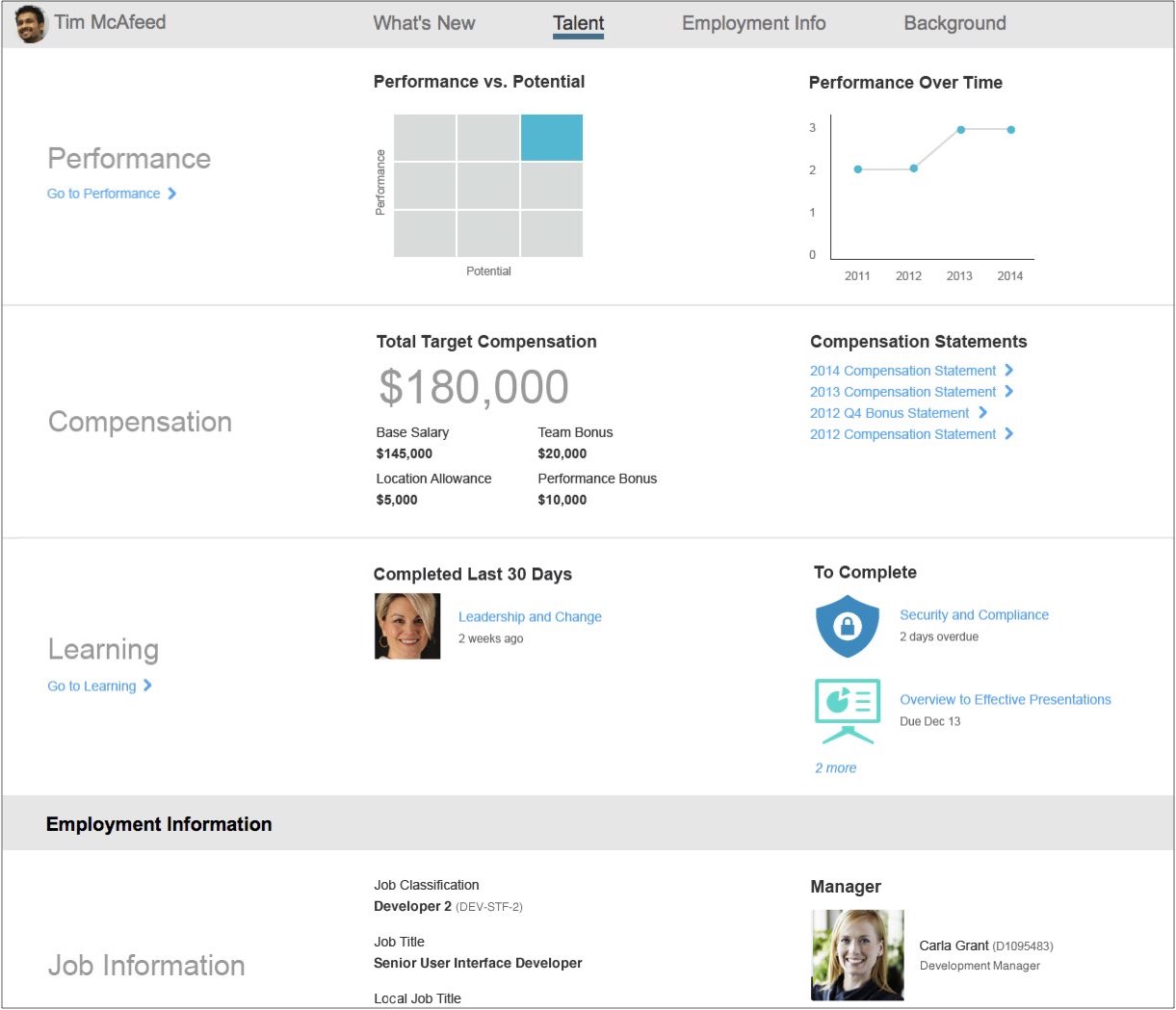
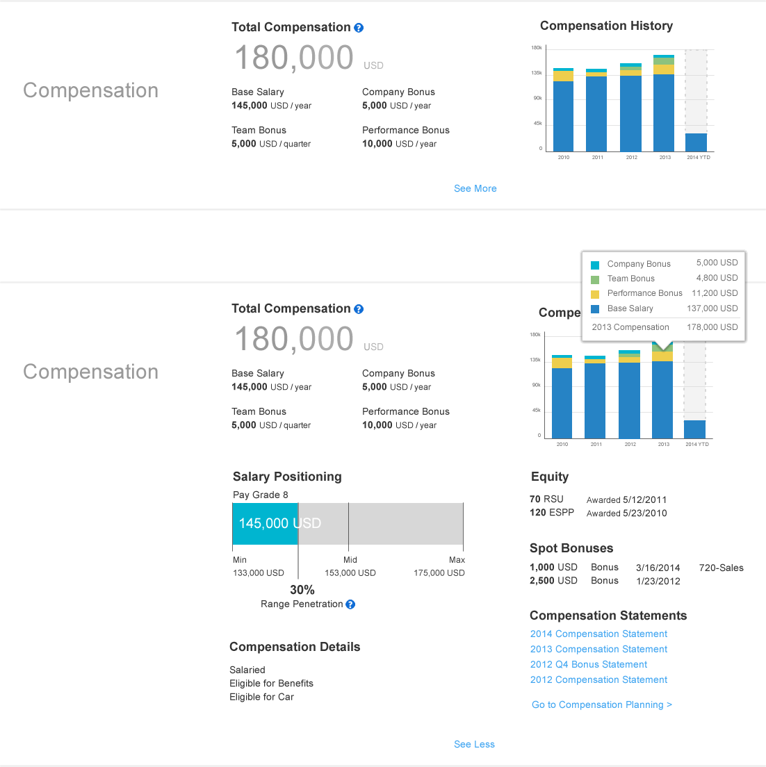
Having sub-sections also simplified the expanding and collapsing of blocks.
The most important information in a sub-section was always shown, and the user could easily expand both blocks of a sub-section downward to see details.
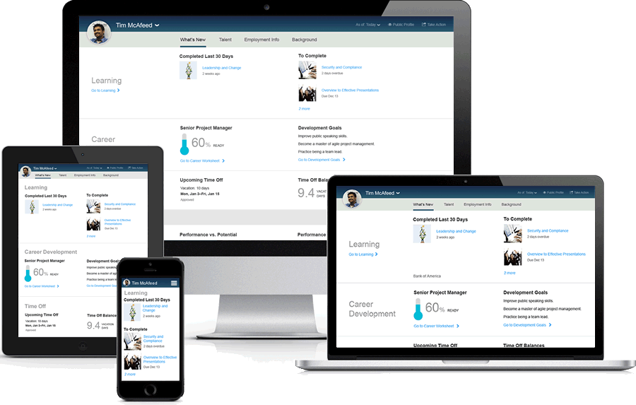
The final design worked well on multiple devices - the titles wrapped to the top as needed, and the layout adjusted to the space available.
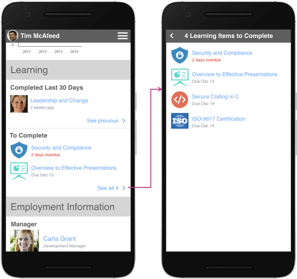
On a phone, the See More link went to a separate page rather than expanding in place.
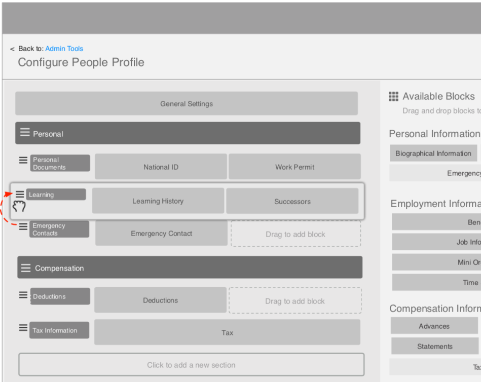
Configuration of the People Profile was critical given the huge variety in how clients used the suite.
I designed an admin interface that allowed clients to create their own custom profile. They could add and name their own sections and sub-sections, and arrange the blocks within them however they wanted.
The design shown here is a wireframe.
The new People Profile delighted users in testing and solved our major usability problems. Although I left before the project launched, while I was there we were already sharing early builds with salespeople, and they were getting excited and sharing them with customers. I took what had been a big competitive disadvantage for the suite, and turned it into something to be proud of.


